Original site (cropped and blurred for privacy).
Key issues
Content clutter & repetition
Key messages and donation prompts repeated across sections, making the page harder to scan.
Discouraging visual tone
Imagery felt negative and distancing misaligned with a mission built on empathy and human connection.Desktop patterns felt “mobile-stretched”
Long, stretched button styles and mobile-like UI elements reduced perceived quality and clarity on desktop.Unfocused CTA strategy
A “Donate” CTA appeared after nearly every section, disrupting flow instead of guiding intentional action.Overloaded footer
The footer was dense and difficult to navigate on desktop.


Design decisions
Rebuilt hierarchy and tightened copy
Removed duplication, improved content rhythm, and kept attention on primary actions.
Unified a calm visual language (brand + UI)
Redesigned the logo, updated the color palette, and aligned icons and photography into a precise, reassuring system.Defined a warmer photographic direction
Shifted to human, empathetic imagery to increase approachability and trust in a sensitive context.Standardized a web-first UI system
Introduced consistent components, spacing, and layout structure for a cleaner, more credible desktop experience.Simplified navigation touchpoints
Reduced interruptions with more intentional CTA placement and a clearer, lighter footer structure.
Insights & Research
Target Users
Two primary intents: people seeking immediate emotional support, and visitors who want to help (donate). The experience must feel clear, calm, and trustworthy.
Key Insights
Competitive scan of similar nonprofits + an audit of Makshivim’s existing site to identify friction points and trust gaps. Findings informed structure, CTAs, and tone.
Constraints & Time
Clarity comes from non-overwhelming structure, fast access to information, and CTAs placed when users need them. A warm visual language supports trust.
UX/UI
Makshivim Nonprofit

Redesigned “Makshivim” an immediate emotional-support nonprofit website, to improve clarity and trust while keeping a warm, empathetic tone.
Role: UX/UI (Team of 2)
Platform: Web
Duration: 8 weeks

UX/UI
Makshivim Nonprofit
Redesigned “Makshivim” an immediate emotional-support nonprofit website, to
improve clarity and trust while keeping a warm, empathetic tone.
Role: UX/UI (Team of 2)
Platform: Web
Duration: 8 weeks
UX/UI
Makshivim Nonprofit
Redesigned “Makshivim” an immediate emotional-support nonprofit website, to improve clarity and trust while keeping a warm, empathetic tone.
Role: UX/UI (Team of 2)
Platform: Web
Duration: 8 weeks
Insights & Research
Target Users
Two primary intents: people seeking immediate emotional support, and visitors who want to help (donate). The experience must feel clear, calm, and trustworthy.
Research Approach
Competitive scan of similar nonprofits + an audit of Makshivim’s existing site to identify friction points and trust gaps. Findings informed structure, CTAs, and tone.
Key Insights
Clarity comes from non-overwhelming structure, fast access to information, and CTAs placed when users need them. A warm visual language supports trust.
Overview
In this redesign, I transformed a dense, content-heavy website into a clearer and more supportive experience by rebuilding the information architecture, reorganizing content to reduce repetition and improve clarity, and rewriting key copy. I redesigned the flow and core functionality around users’ needs, making key actions easier to find and complete through a smarter, more intuitive experience. I also created a visual language and imagery system designed to strengthen credibility, trust, and a stronger sense of support.

Interactive flow
Interactive flow
Original site (cropped and blurred for privacy).
Key issues
Content clutter & repetition
Key messages and donation prompts repeated across sections, making the page harder to scan.
Discouraging visual tone
Imagery felt negative and distancing misaligned with a mission built on empathy and human connection.Desktop patterns felt “mobile-stretched”
Long, stretched button styles and mobile-like UI elements reduced perceived quality and clarity on desktop.Unfocused CTA strategy
A “Donate” CTA appeared after nearly every section, disrupting flow instead of guiding intentional action.Overloaded footer
The footer was dense and difficult to navigate on desktop.
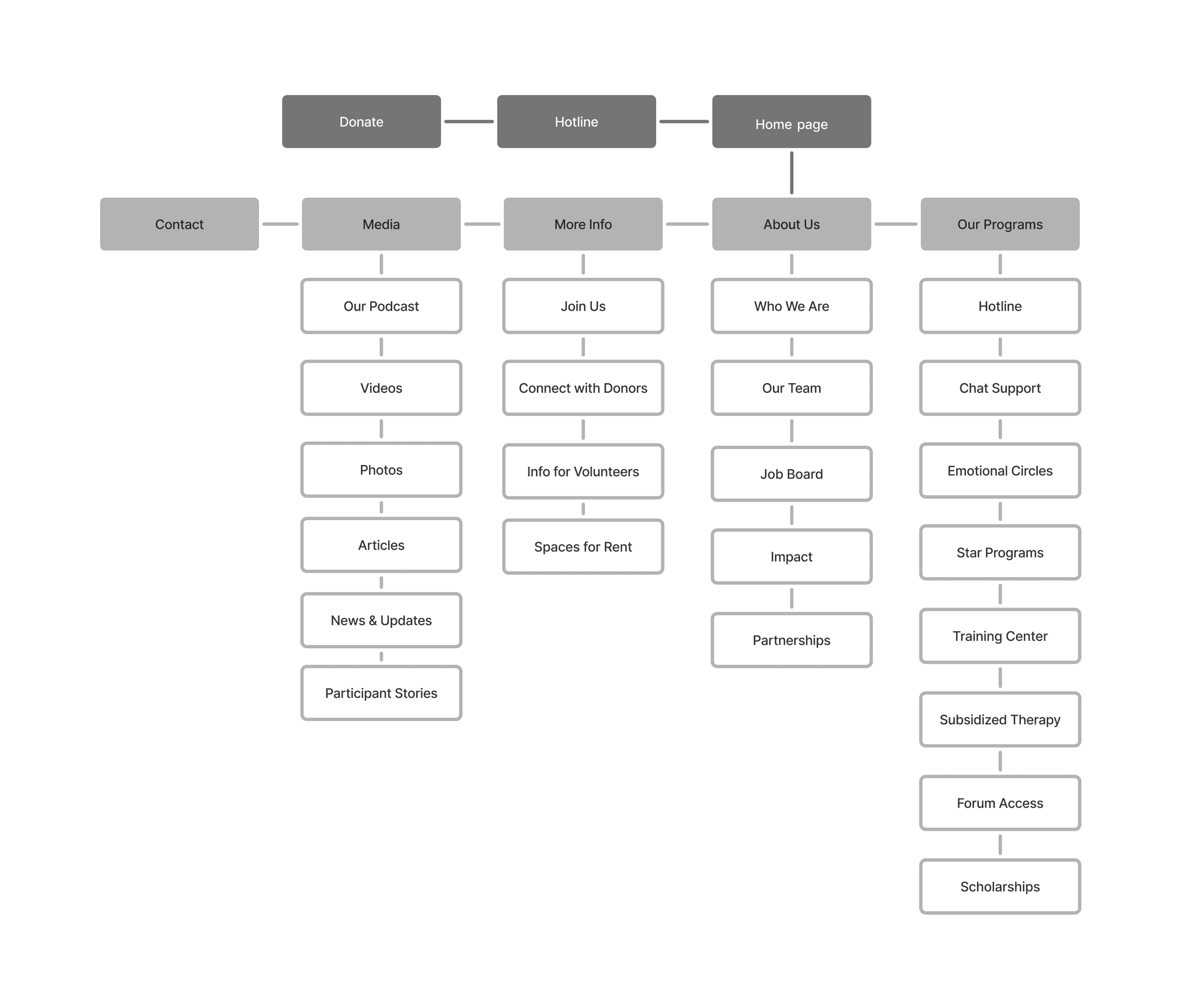
Information Architecture

Information Architecture
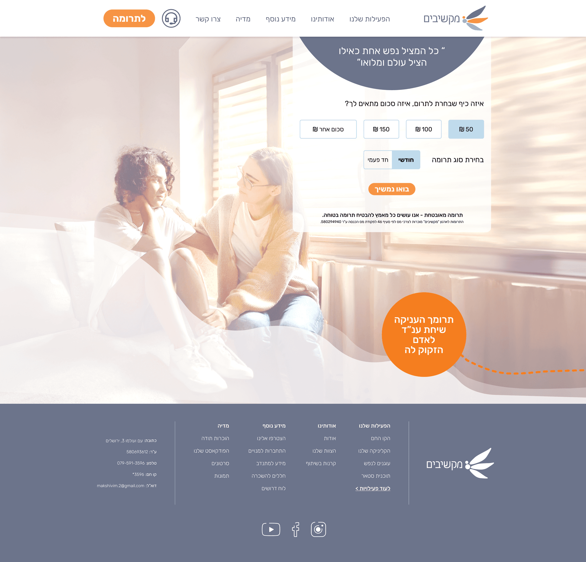
Final UI
Key screens from the final website.


CTA with impact feedback
Each amount triggers an impact message that helps users decide faster and proceed to donate.


CTA with impact feedback
Each amount triggers an impact message that helps users decide faster and proceed to donate.
CTA with impact feedback
Each amount triggers an impact message that helps users decide faster and proceed to donate.
Explore more projects
UI Style Guide
Logo Design
A clean, minimal wing mark designed to evoke relief, lightness, and freedom, reflecting Makshivim’s supportive mission. The form balances softness with precision to communicate empathy and trust.
buttons
Body 1
Rubik Bold | 24 PX
Rubik regular | 18 PX
Heading 1
Heading 2
Rubik Medium 32 PX
Rubik Medium | 40PX
Typography
Rubik
Aa
Icons

A calm blue foundation supports readability and emotional ease, while orange is used sparingly for high-priority CTAs to guide attention. Light neutrals keep layouts airy, reduce visual load, and maintain a clean, low-friction interface.
Color scheme palette
FEF7EF
F79445
735E46
E3ECF1
#82B8DA
#6C748B
Interactive flow
Insights & Research
Target Users
Two primary intents: people seeking immediate emotional support, and visitors who want to help (donate). The experience must feel clear, calm, and trustworthy.
Key Insights
Competitive scan of similar nonprofits + an audit of Makshivim’s existing site to identify friction points and trust gaps. Findings informed structure, CTAs, and tone.
Constraints & Time
Clarity comes from non-overwhelming structure, fast access to information, and CTAs placed when users need them. A warm visual language supports trust.
Style Guide
Information Architecture

Style Guide
buttons
Body 1
Heading 1
Heading 2
Typography
Rubik
Aa
FEF7EF
F79445
735E46
E3ECF1
#82B8DA
#6C748B
Logo Design
A clean, minimal wing mark designed to evoke relief, lightness, and freedom, reflecting Makshivim’s supportive mission. The form balances softness with precision to communicate empathy and trust.
Icons
Color scheme palette
Final UI
Key screens from the final website.
Final UI
Key screens from the final website.
Logo Design
A clean, minimal wing mark designed to evoke relief, lightness, and freedom, reflecting Makshivim’s supportive mission. The form balances softness with precision to communicate empathy and trust.
buttons
Body 1
Heading 1
Heading 2
Rubik
Aa
Rubik Bold | 24 PX
Rubik regular | 18 PX
Rubik Medium 32 PX
Typography
Rubik Medium | 40PX
Icons
Color scheme palette
A calm blue foundation supports readability and emotional ease, while orange is used sparingly for high-priority CTAs to guide attention. Light neutrals keep layouts airy, reduce visual load, and maintain a clean, low-friction interface.
FEF7EF
F79445
735E46
E3ECF1
#82B8DA
#6C748B
In this redesign, I transformed a dense, content-heavy website into a clearer and more supportive experience by rebuilding the information architecture, reorganizing content to reduce repetition and improve clarity, and rewriting key copy. I redesigned the flow and core functionality around users’ needs, making key actions easier to find and complete through a smarter, more intuitive experience. I also created a visual language and imagery system designed to strengthen credibility, trust, and a stronger sense of support.
Overview